client /
AGRIMONTANA
JOB /
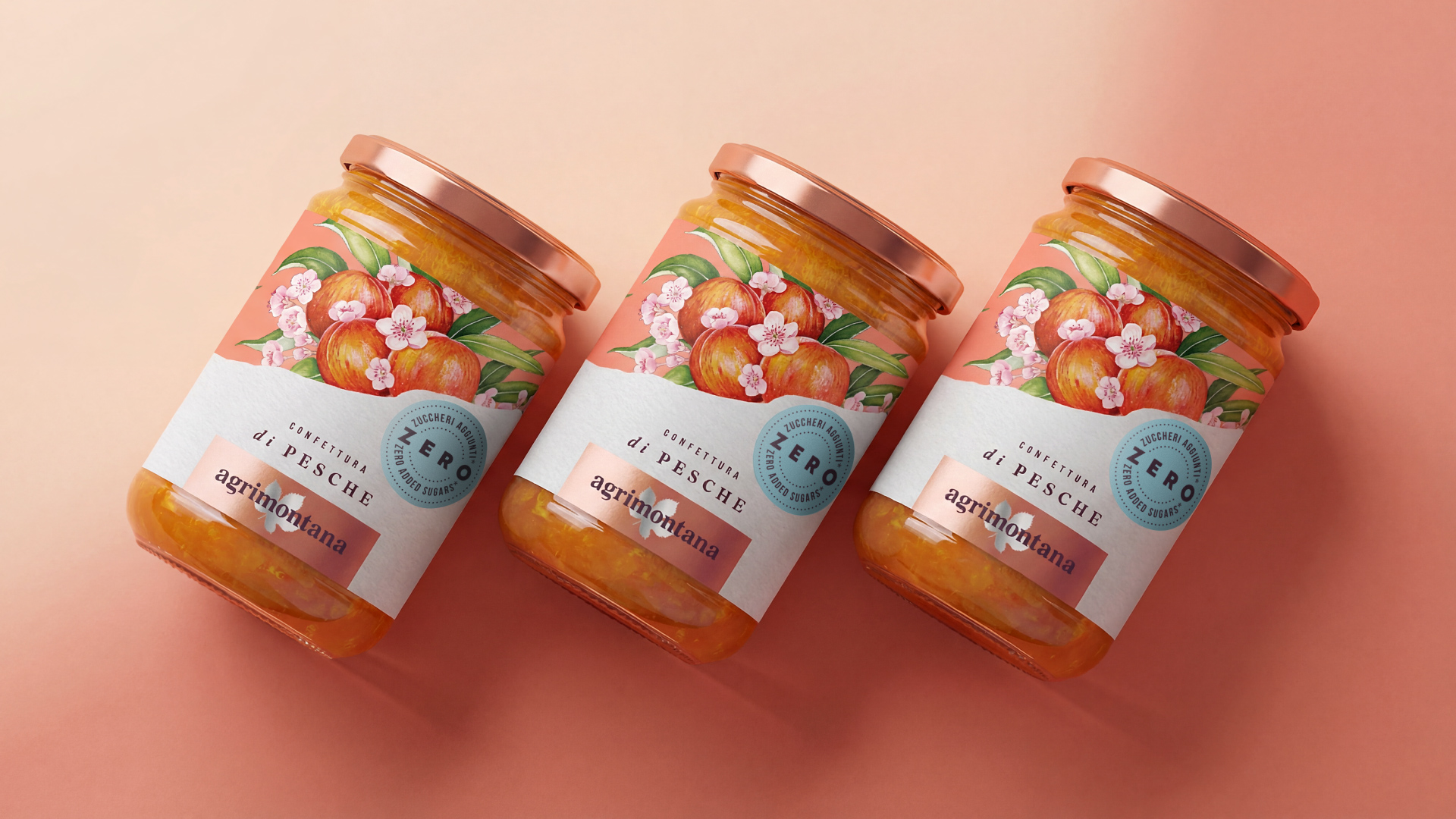
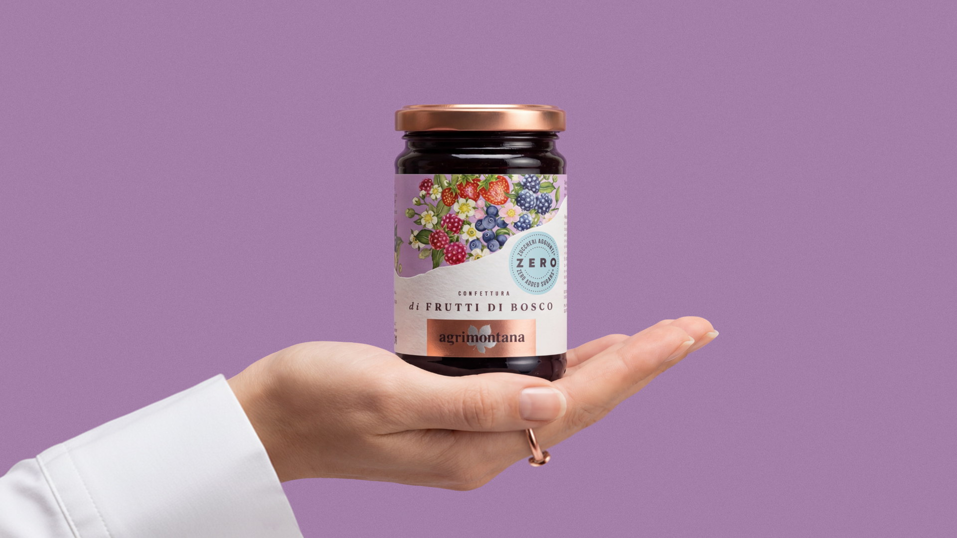
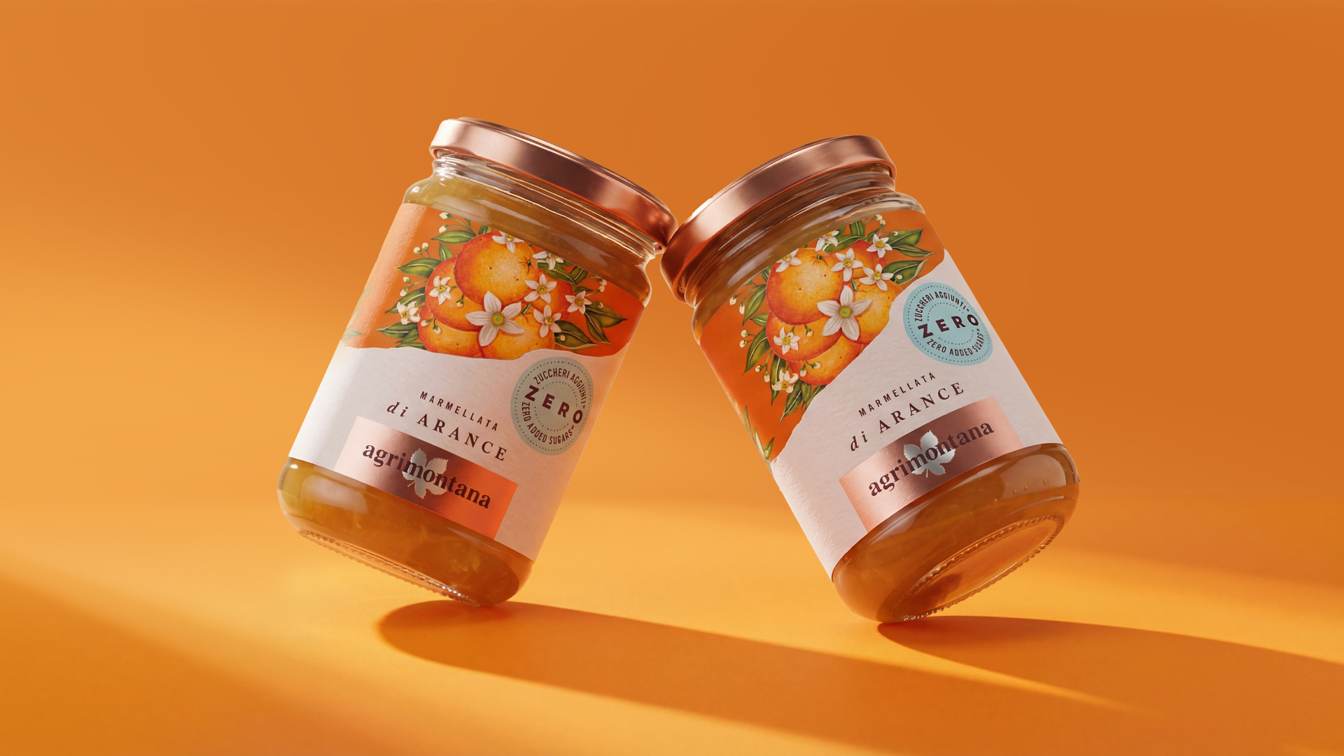
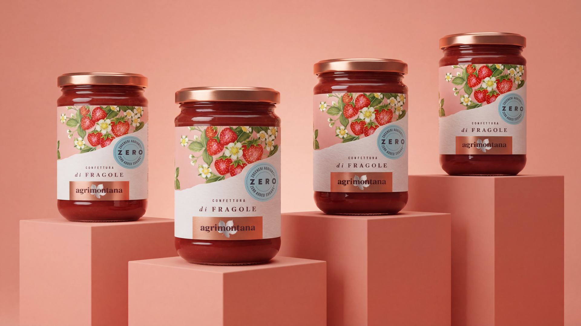
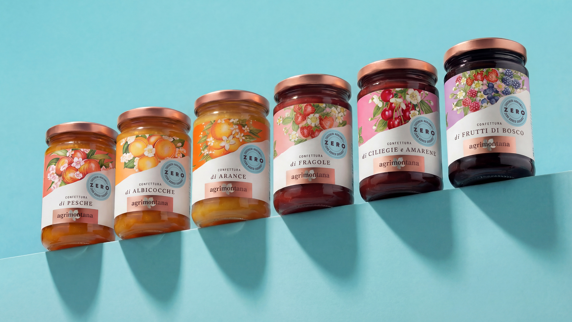
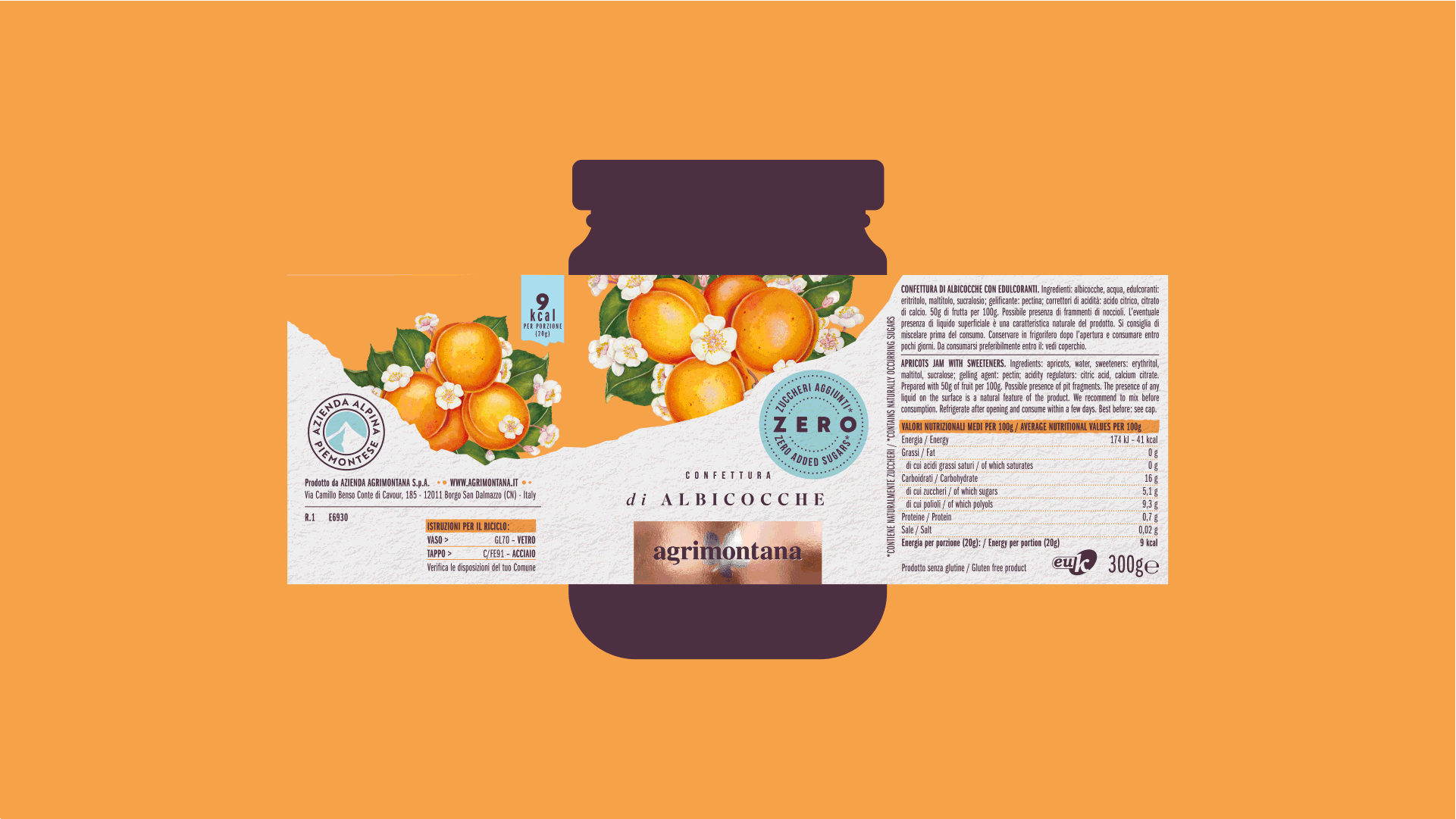
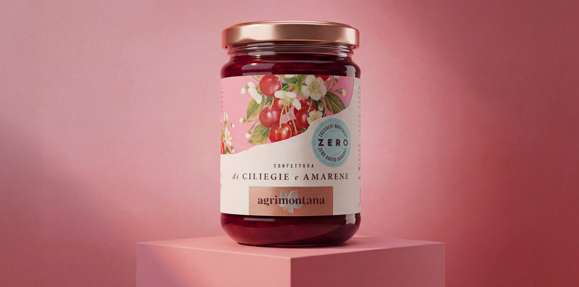
Today, food is increasingly chosen for its flavor, with a growing focus on calorie intake. Within this context, the packaging identity of Agrimontana’s new Zero Added Sugar range tells the story of a delicate balance between the rich sensory world of pastry-making and a surprisingly light gastronomic experience.
the brief:
Agrimontana is a historic and thriving Italian company based in Piedmont, within the Gesso and Stura River Park. Founded in 1972 by Cesare Bardini, the company was born with the ambition of becoming a benchmark for quality and innovation in the world of fruit-based products, dried fruit, chocolate, semi-finished products, ingredients, and services for pastry professionals. For over fifty years, Agrimontana has worked closely with the finest pastry chefs, firmly believing that respect for raw materials is the key to creating products of exceptional quality—rich in flavor and able to preserve all the nutritional properties of fruit. In line with this vision, new recipes for the Zero Added Sugar line were developed: fruit preserves capable of delivering an intense and satisfying taste experience with only 7–8 calories. The client’s request was therefore to develop a premium range identity able to express care, expertise, and the ability to transform fruit into a gastronomic experience that is as delicious as it is light.
strategy:
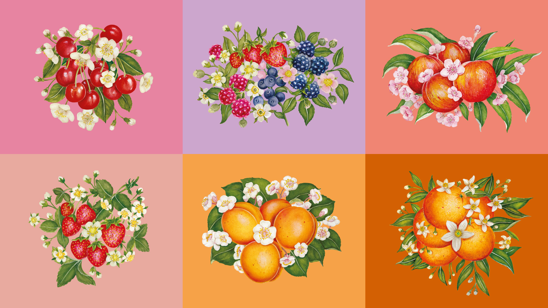
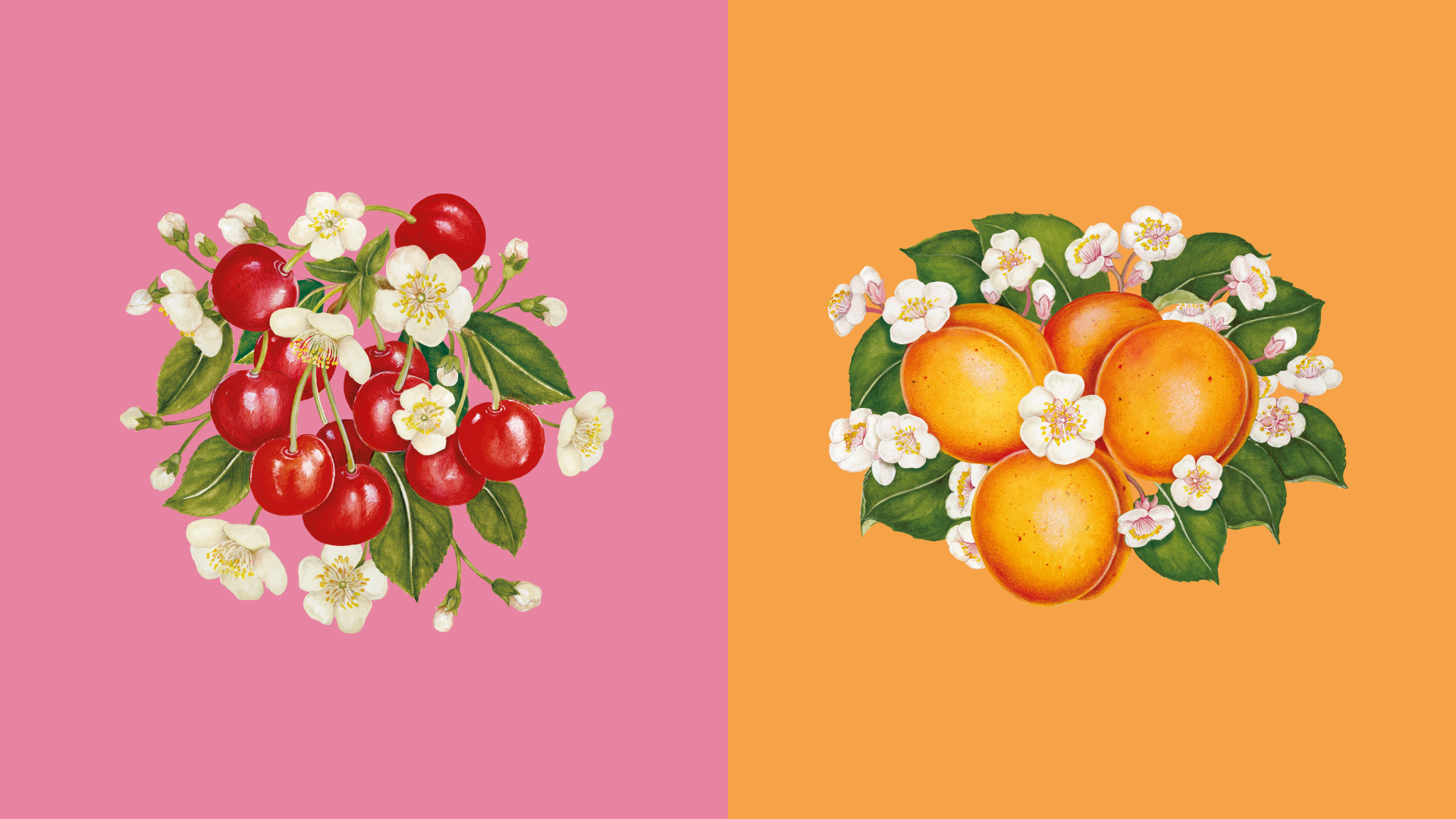
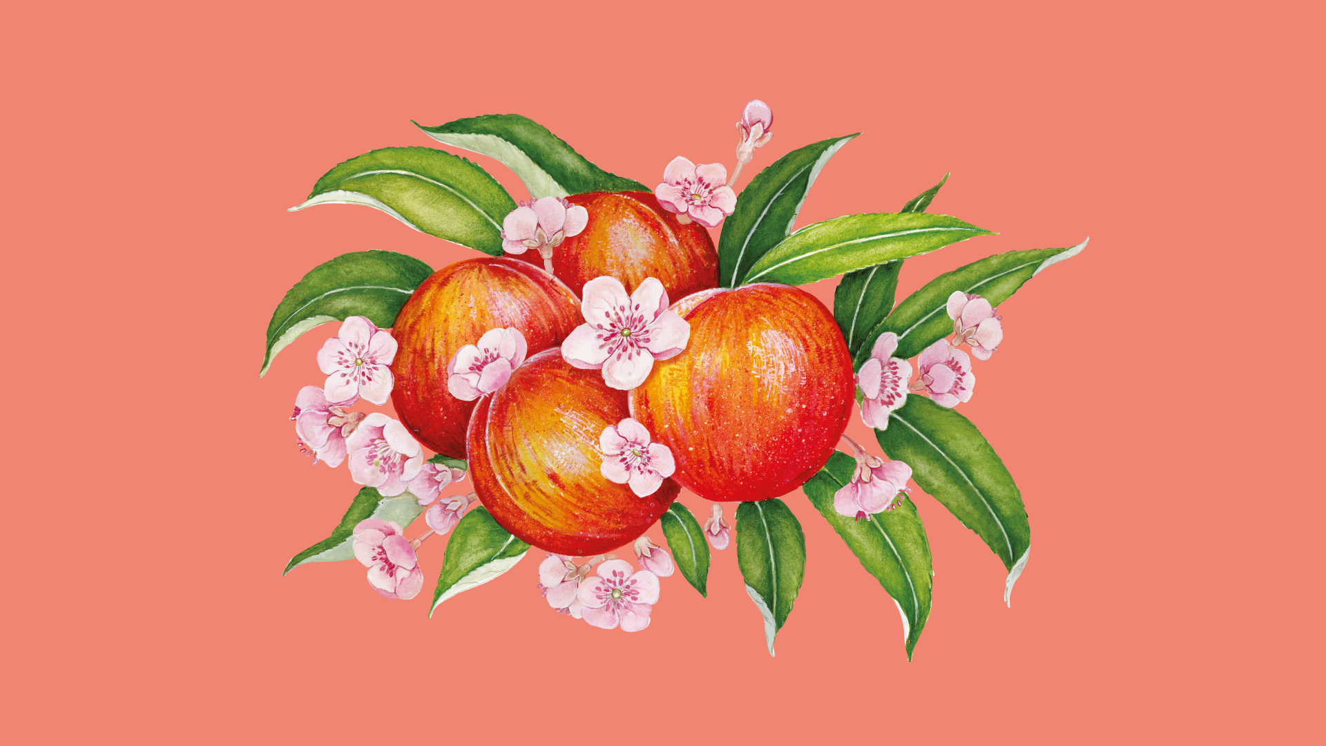
For the new Agrimontana Zero Added Sugar range, we designed a packaging concept that stands as a true statement of intent: inside, the premium quality recognized worldwide… with only 7–8 calories. The main challenge was finding the right balance between three essential needs: conveying the indulgent, rich nature of fruit; clearly communicating the lightness of the new recipes—just 7 calories!—and doing so through a visual language consistent with the brand’s premium positioning and the experience Agrimontana represents. This led to the idea of allowing two seemingly opposite worlds to coexist at first glance: taste and lightness. The premium character is emphasized through meticulous attention to materials and printing techniques. Fruit, the absolute protagonist, is illustrated by hand using a refined mix of watercolor and tempera, and printed on the smooth side of the paper. A clean, bright white point enhances its natural quality and visual intensity. This richer element interacts with the purity and lightness of the white paper, expertly embossed with a custom-designed relief that evokes the delicacy of the sensory experience. The torn paper detail becomes a symbolic element, representing the ‘masterpiece’ of recipes capable of uniting two worlds that once seemed irreconcilable. The light-blue seal brings the narrative to a close and reinforces the reason to believe: Zero Added Sugar. Secondary elements of the pack have also been crafted with great care. A small flag highlights the low calorie content, echoing the style and color of the blue seal, while a mark proudly certifies the company’s Piedmontese origin.
less...
More...